Mordisco
Trabajamos en la creación de la identidad de MORDISCO que no es es sólo ropa, es una marca que impulsa la sinfonía de lo sensual y la feminidad. Son piezas únicas que evocan al deconstructivismo y que están dirigidas a quienes anhelan la moda con otra perspectiva.
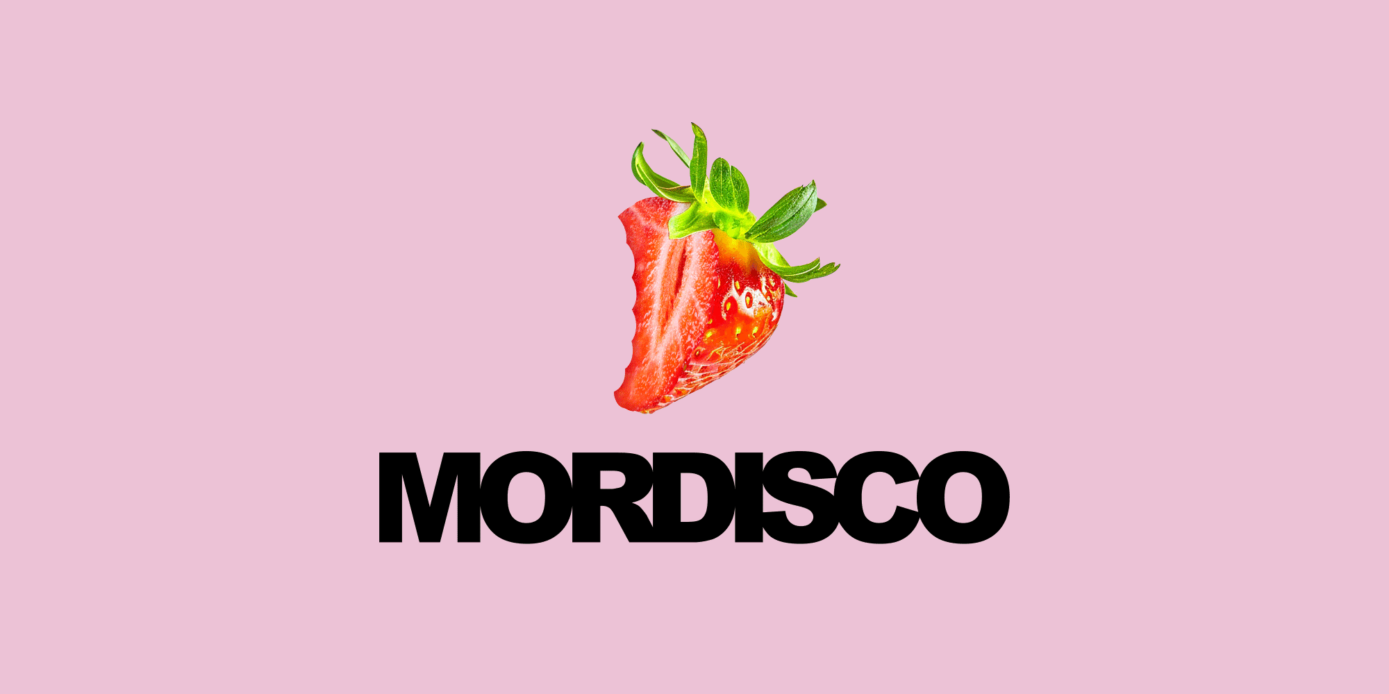
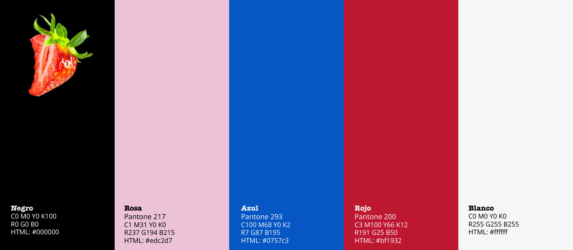
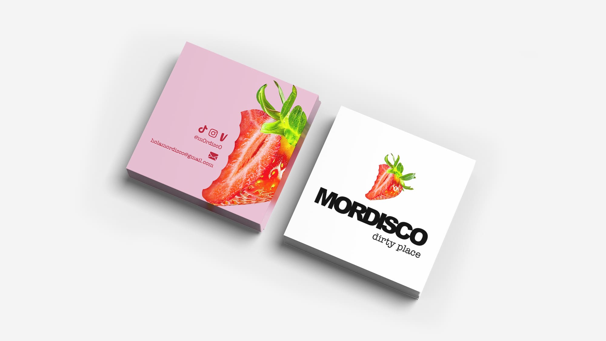
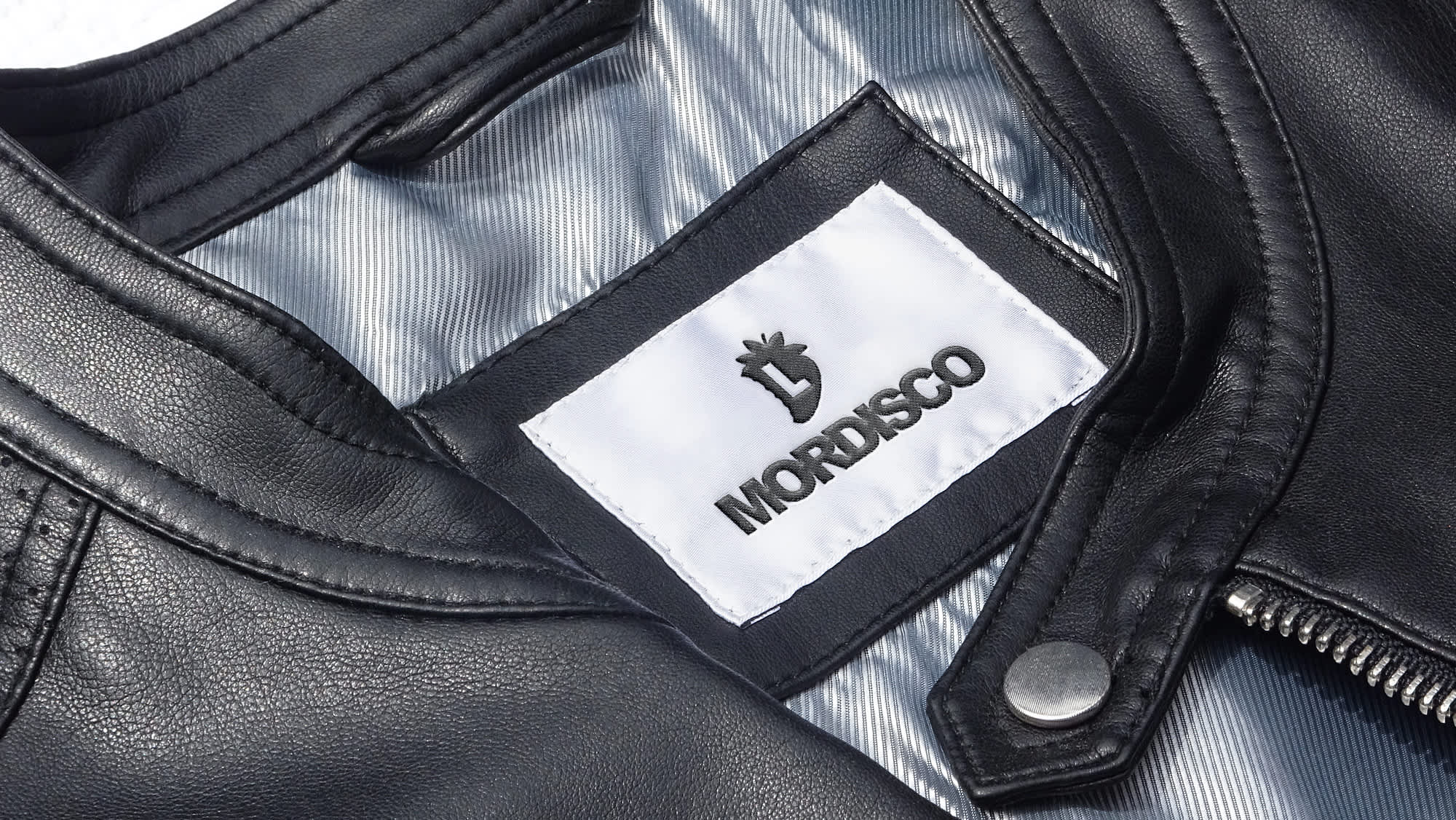
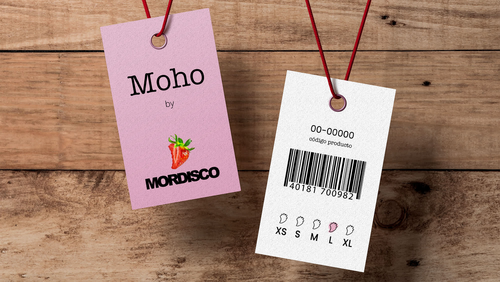
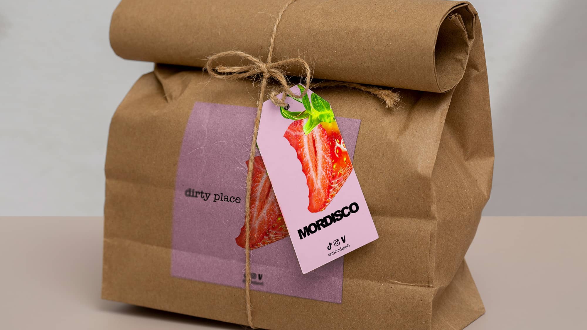
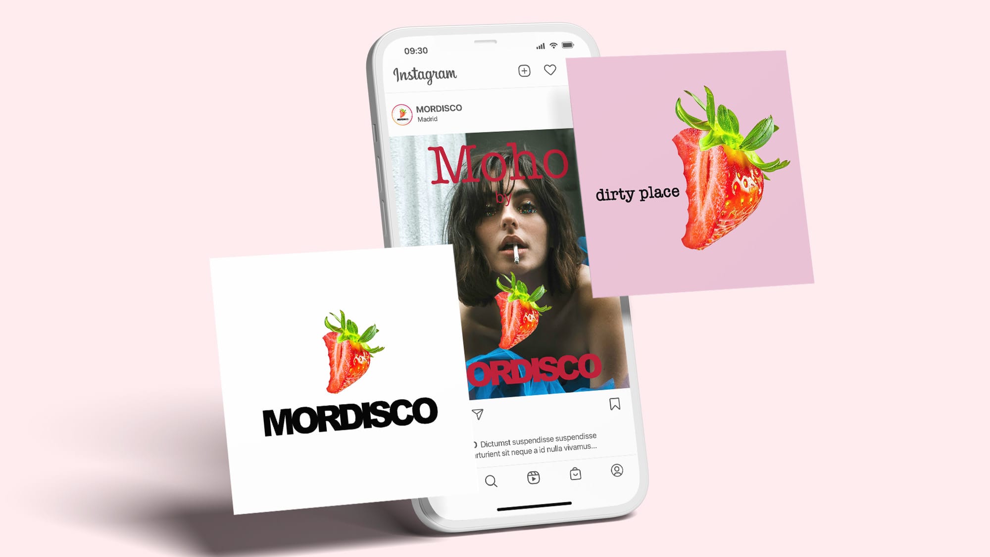
El logotipo consiste en el símbolo “fresa con mordisco” que representa la feminidad con un toque provocativo y grunge. Su paleta de tonos neutros y vibrantes transmite confianza y singularidad.
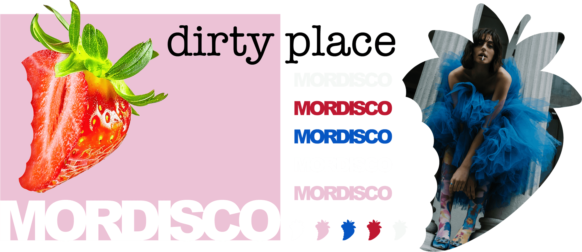
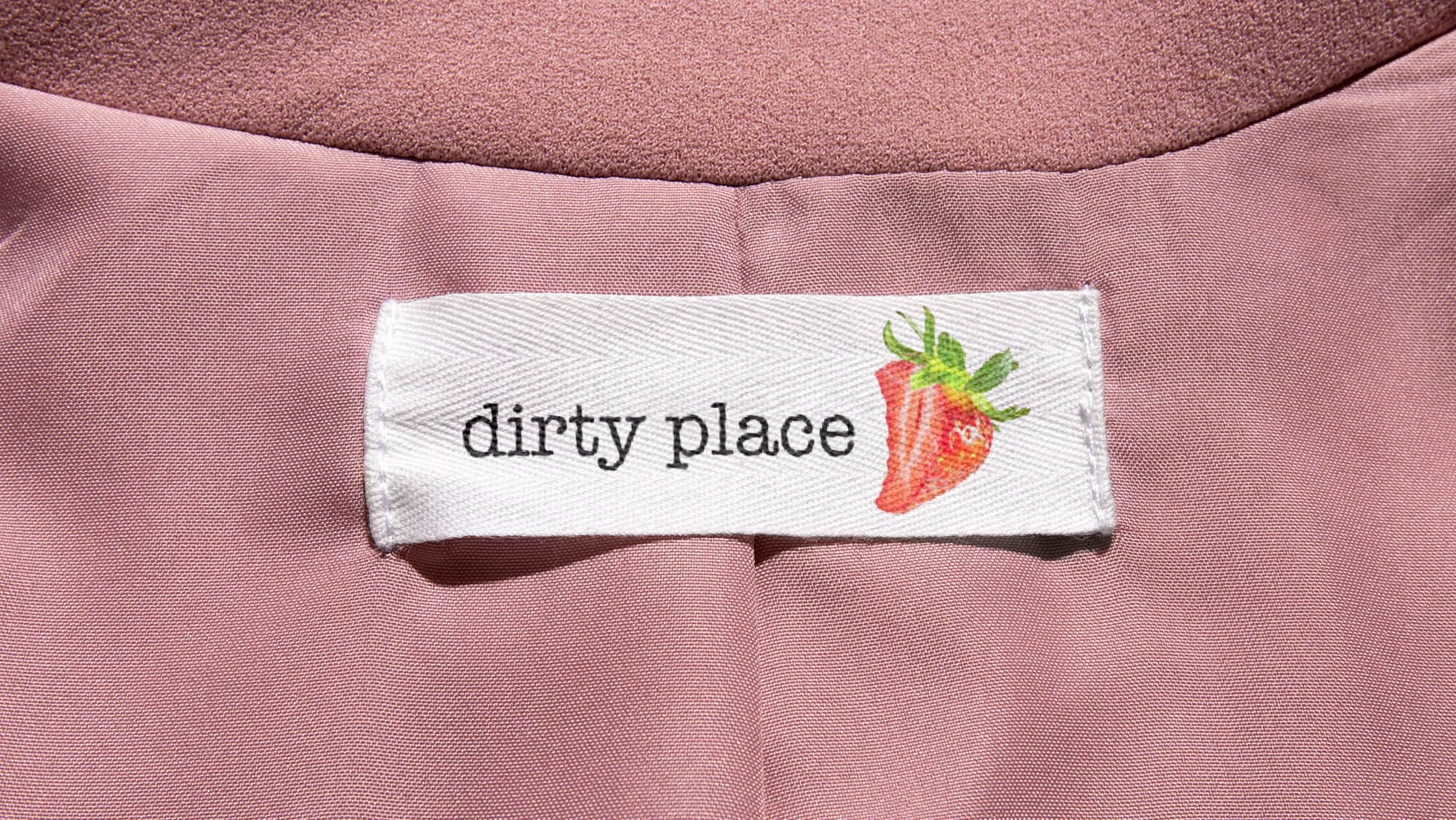
Su sistema gráfico combina la intervención y el ícono plano del símbolo como dos tipografías muy distintas para comunicar el atrevimiento de una marca seria.
We worked on the brand identity for MORDISCO, which is more than just clothing—it is a brand that drives the symphony of sensual and femininity. These are unique pieces that evoke deconstructivism, designed for those who crave fashion from a different perspective.
The logo features the "bitten strawberry" symbol, representing femininity with a provocative, grunge twist. Its palette of neutral and vibrant tones conveys confidence and singularity.
Its graphic system combines the symbol's intervention and flat icon with two highly distinct typefaces to communicate the boldness of a serious brand.
CLIENTE | PROYECTO
MORDISCO, España.
Creación de Identidad, Sistema Visual, Guía de Identidad, 2024
CLIENT | PROJECT
MORDISCO, Spain.
Brand Identity, Visual System, Identity Guidelines, 2024